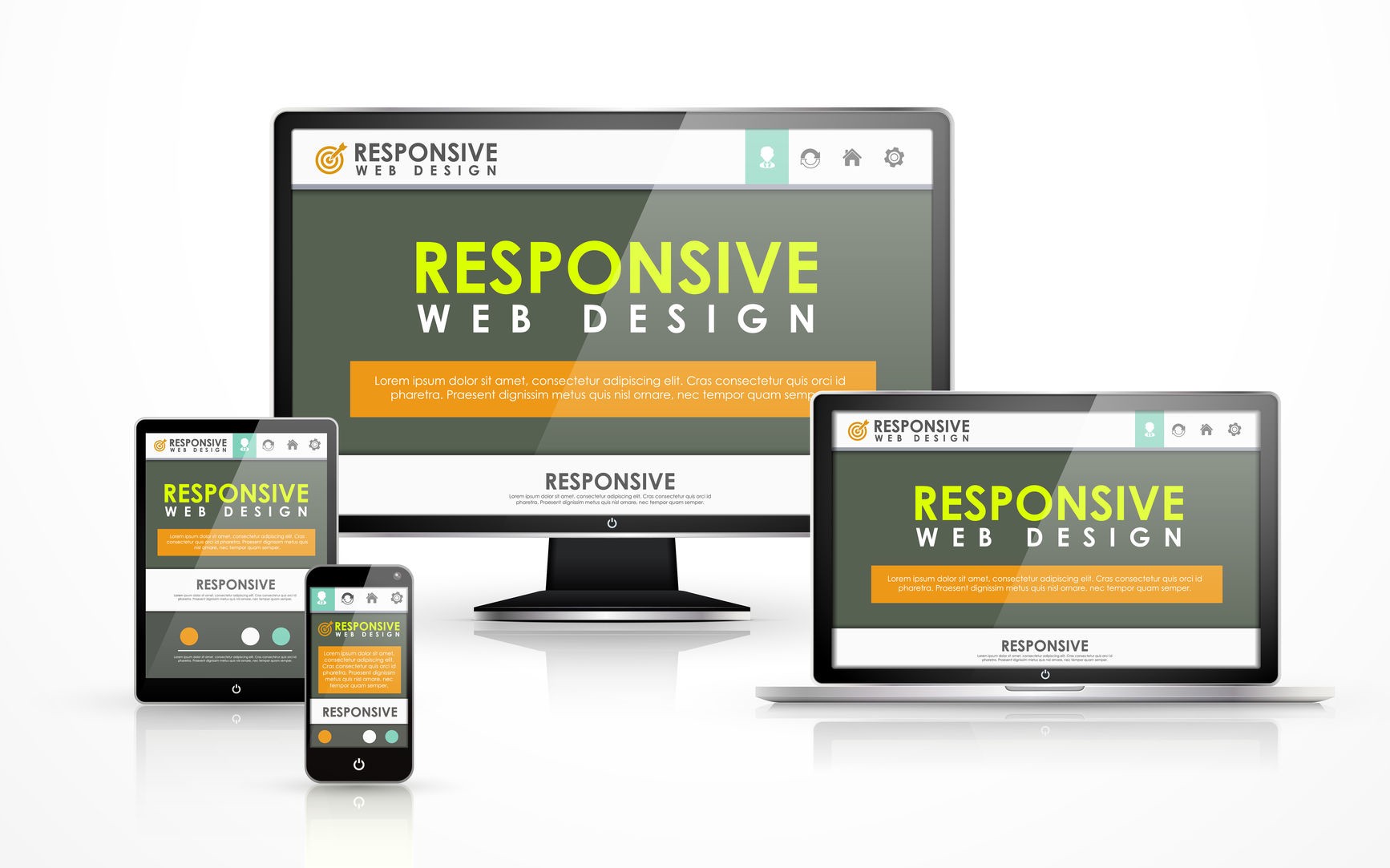
Responsive Web Design:
Responsive Web Design creates websites that adjust to different screen sizes, devices, and orientations. Websites must deliver a good user experience across smartphones, tablets, and desktops due to the proliferation of gadgets.
Fluid grids, flexible images, and media queries are used in responsive web design.
Here are some key components and principles of responsive web design:

1. Fluid Grids:
Responsive designs use relative units like percentages or ems for layout elements instead of fixed pixel widths. This allows the website’s layout to adjust proportionally based on the screen size.
2. Flexible Images and Media:
Images and media elements are scaled and resized fluidly to fit the screen. This prevents images from overflowing or being too small on different devices.
3. Media Queries:
CSS media queries apply different styles dependent on the user’s device’s screen width, height, and resolution. Designers can use media queries to create specific layouts and styles for different screen sizes.
4. Breakpoints:
Breakpoints are specific screen widths at which the layout of the website changes. They are defined using media queries, allowing designers to optimize the design for different screen sizes.
5. Mobile-First Approach:
A mobile-first strategy entails creating and constructing a website from the mobile layout and expanding it for larger devices. This ensures that the website is optimized for mobile devices, which are often the primary access point for users.
6. Content Prioritization:
In responsive web design, content prioritization becomes crucial. Designers must highlight key components on smaller screens while hiding or rearranging additional items.
7. Cross-Browser and Device Testing:
To provide best user experience across platforms, responsive designs should be tested on numerous devices, browsers, and screen sizes.
Responsive web design automatically optimises websites for desktops, tablets, and smartphones. By allowing visitors to view the website from numerous devices, this technique improves user engagement, bounce rates, and conversions.
Responsive Web Design: Tips and Practices:
Here are some tips and best practices to consider when implementing responsive web design:

1. Plan for Mobile First:
Start designing and developing your website with a mobile-first approach. This ensures your site is optimized for smaller screens and slower network connections. You can progressively enhance the design and functionality as you scale up to larger screens.
2. Use a Responsive Framework:
Consider using a responsive framework or grid system like Bootstrap or Foundation. These frameworks provide pre-built responsive components and layouts that can speed development and ensure device consistency.
3. Optimize Images:
Use responsive images that adapt to different screen sizes. Optimize the file sizes of images to minimize load times on mobile devices. You can also use lazy loading or responsive image breakpoints to deliver appropriate images based on the device’s capabilities.
4. Prioritize Content:
Prioritize your content based on importance and relevance. Ensure the most critical content is visible and easily accessible on smaller screens. Use progressive disclosure techniques to hide less important content behind expandable sections or menus.
5. Breakpoints:
Choose breakpoints strategically to define where your layout will change based on different screen sizes. Consider the common screen widths of popular devices and test your design thoroughly at these breakpoints.
6. Test Across Devices:
Test your responsive design across various devices and screen sizes. Use emulators, simulators, and real devices to ensure your website looks and functions as intended on different platforms and browsers.
7. Maintain Performance:
Responsive web design should not sacrifice performance. Optimize your code, minimize file sizes, and reduce the number of HTTP requests to ensure fast loading times on all devices.
8. Consider Touch Interactions:
Mobile devices primarily use touch interactions. Design your buttons, links, and navigation elements with touch-friendly sizes and spacing to enhance usability on touchscreens.
9. Use Fluid Typography:
Implement fluid typography using relative units like percentages or ems. This allows your text to scale smoothly with the screen size, ensuring legibility and readability across devices.
10. Test and Iterate:
Test your responsive design and gather user feedback. Iterate and make improvements based on user behavior and preferences. Monitor analytics to identify any issues or areas for improvement.
Following these tips and best practices, you can create a responsive web design that provides an optimal user experience across devices, improves usability, and boosts engagement.
Importance of Responsive Web design:
Responsive web design is of great importance in today’s digital landscape.

Here are some key reasons why responsive web design is crucial:
1. User Experience (UX):
Responsive design ensures a seamless and consistent user experience across different devices and screen sizes. Whether users access a website on a desktop computer, laptop, tablet, or smartphone, responsive design adapts the layout and content to fit the screen, providing optimal readability and navigation. This improves user engagement, reduces bounce rates, and increases the likelihood of conversions.
2. Mobile Usage:
With the widespread use of mobile devices, having a responsive website is essential. Mobile traffic has surpassed desktop traffic in recent years, and search engines like Google prioritize mobile-friendly websites in their search results. By providing a responsive experience, you can reach and engage a larger audience, catering to the needs and preferences of mobile users.
3. SEO Benefits:
Search engine optimization (SEO) is crucial for improving a website’s visibility and driving organic traffic. Responsive design plays a significant role in SEO, as it eliminates the need for separate mobile and desktop versions of a website. A single responsive site consolidates your content and backlinks into one URL, making it easier for search engines to crawl and index your pages. Additionally, responsive websites tend to have lower bounce rates and higher engagement, positively impacting SEO rankings.
4. Cost and Maintenance Efficiency:
Building and maintaining separate website versions for different devices can be costly and time-consuming. Responsive design eliminates the need for multiple versions using flexible layouts and CSS media queries that adapt the content to the user’s device. This streamlines development reduces maintenance efforts, and ensures consistent updates and improvements across all platforms.
5. Future-Proofing:
The digital landscape constantly evolves, with new devices and screen sizes emerging. Responsive design provides a future-proof solution by automatically adjusting to different devices, resolutions, and technologies. Rather than constantly redesigning and redeveloping for each new device, a responsive website can adapt and scale with minimal adjustments.
In summary, responsive web design is essential for delivering an optimal user experience, accommodating the growing mobile audience, improving SEO rankings, reducing costs and maintenance efforts, and future-proofing your online presence. By embracing responsive design principles, you can create a website that performs effectively across various devices, ensuring engagement, conversions, and business success.